New features in MyGet 1.7
We’re happy to announce we’ve completed another sprint. The main focus for this sprint was to start a redesign of our user experience. Next to that, new features have been introduced as well. Let’s have a look at what has changed and which cheese we moved.
A complete change log can be found on our new documentation site.
First steps in redesigning the MyGet experience
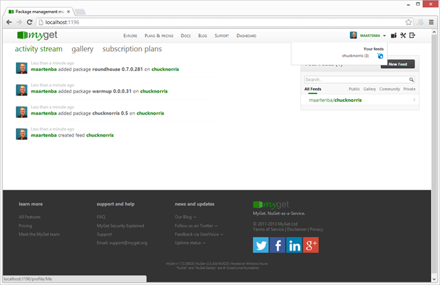
One of the first things you will notice when logging in to MyGet is that we’ve drastically changed the look and feel of the homepage. First of all, we decided the header we had earlier was too high and didn’t add much value. We’ve now condensed the header when authenticated. Your gravatar image will be shown and when hovering your username, a list of all feeds you have access to will be shown.
The initial view you get is an activity stream. This provides the latest information about your feeds as well as the packages on it. On the right side, we’ve added quick navigation to all your feeds.
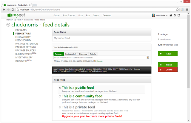
The feed details page now features a couple of additional buttons: you can clone a feed as well as delete a feed from that page.
We’re planning on further improvements in our next sprint!
New features and improvements
The following new features have been deployed:
- NuGet Package Source Discovery is now enabled for all feeds as well as the MyGet Gallery
- MyGet supports the NuGet 2.5 improved search syntax
- Traditional username/password user registration is now possible
- When assigning privileges to other users, searching users is now supported
- Transferring feed ownership is now possible
- Build Services now supports build.cmd and build.ps1 files as well
- Build Services provides support for pushing symbols packages
- Build Services comes with AssemblyVersion patching
- Our new documentation site is live at docs.myget.org. Documentation is open source and contributing earns you free subscription periods!
In the coming days, we will be blogging about these features in more detail.
The page load speed of MyGet has improved as well. We’ve been working on optimizing file sizes, compression and are using CSS sprites for many of our images.
We hope you like this new drop. Let us know your thoughts in the comments below!
Happy packaging!

